Over the years, progressive rock has garnered a well deserved reputation for giving the world some of the most creative album art. In addition to the famously epic musical creations created by groups such as Yes, Kansas and others, progressive rock has long been known for iconic album cover imagery. Just think of the famous prism on “Dark Side of the Moon.”
Solid Entertainment And Classic Imagery
When it comes to graphic imagery, Rush has long been known as one of the bands with the biggest budgets and grandest imaginations. Rush albums are known for thought provoking images, which are frequently filled with puns, in-jokes, and hints as to the content Neil Peart’s lyrical matter.
Rush albums have always striven to give the listener just a little bit more than mere casual entertainment. Sure, there’s plenty of virtuoso soloing and headbanging riffs to be found on every one of them. But there’s also plenty of thematic lyrical content for fans to ponder over. And one of the chief components of the group’s lasting appeal has been their penchant for classic visual imagery on nearly all of their releases.
The Most Famous Graphic Design
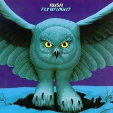
While records such as Hemispheres, Grace Under Pressure, and Fly By Night all have memorable and creative cover designs, one would be hard pressed to find a more iconic candidate for the title of “Most Famous Rush Graphic Design” than Moving Pictures. It’s a true classic, and also a real head-scratcher.
The image of the hirsute men in red uniforms delivering (or is it pilfering?) the classic art to or from the grand looking building really manages to set the listener’s expectation that something grand lies in store for them once they put the needle on the record (or, these days, press “Play”). It’s a truly intriguing mix of color, content, and creative presentation that every prog rock fan has probably spent hours questioning and analyzing!
Graphic artist Hugh Syme won a “Best Album Graphics” Juno Award for Moving Pictures. You can view an interview with Mike Dixon, who worked with Syme and played the role of one of the movers moving a painting on the legendary Moving Pictures album. It was actually shot as a movie in front of the Ontario Legislative Building in Toronto. Syme was the creative genius behind several of Rush’s cover art, including 2112, A Farewell to Kings, Hemispheres, Grace Under Pressure, Exit Stage Left, Signals and many others.
2112
One of the most iconic and enduring of all Rush albums, past and present, is 2112. The famous red star emblazoned on the cover has been the object of endless controversy and speculation among fans and critics of the long running group. Does the red star signify the infamous Satanic pentagram? Is it an homage to the red star of Communism? What’s it all about? Syme was the logo’s creative instigator.
As it turns out, the famous five pointed explosion of color isn’t meant to be any of those things. Neil Peart, who penned the lyrics of the epic 20-minute title track, meant the red star to be a representation of the United Federation of Planets, the mythical galactic government that causes all the trouble for the song’s youthful protagonist (and, no, this article won’t provide any further spoilers as to the song’s plot line!). The recent reissue edition includes liner notes from Peart that go further into the matter, and also reveal that part of the inspiration came from his reading of famous Libertarian author Ayn Rand.
The Most Underrated Rush Album Design
While the group has always striven to provide its listeners with the ultimate quality product, it is true that a few of their releases have been less than stellar when it comes to the artwork provided. For example, their debut was a hurried affair, recorded on a shoestring budget with minimal funds left over to pay for the sleeve art.
However, since most of the group’s releases have been hotly anticipated and very well received, it was bound to happen that a few of them have been overlooked or lost in the shuffle. Fly By Night, in particular, is an album that many Rush fans rate less highly than they should. Not only do many fans of the group overlook the ground breaking synthesis of Zeppelin-ish hard rock and Yes-styled prog, but they also forget about one of the sleeve designs that practically defined their early era.
The simple, somewhat amateurish, presentation of a giant owl like creature touching down on a snowy Canadian field might be somewhat dated and comical by today’s sophisticated and exacting standards. However, in the far off days of the mid 1970s, such imagery was par for the course, and certainly helped to set the tone for the music that discerning listeners hoped to discover within. Fly By Night was also, of course, the first release to feature new drummer Neil Peart, so a bit of imaginative imagery was quite in order to mark the occasion.